POWER/GRID: Graphic Depictions of War
BY Andrew Loman
June 2018
“I chose a grid-system rather than free-form because it was a history. To me there’s something very stable about the nine-panel grid and I wanted that feeling for it.” So said the St John’s cartoonist Wallace Ryan, explaining the page design he has chosen for The Narrow Way, a graphic memoir about his grandfather’s experiences as a soldier in World War 1.
John Joseph Ryan, who with Regimental Number 38 was one of the First Five Hundred, and was wounded at Gallipoli but still fought at the Somme. One of those young men who’ve become so central to Newfoundland’s sense of itself, he beat the odds by surviving the war: after being wounded in action in November, 1916, and invalided to England, he returned to St John’s, married, and settled into the quiet life of a grocer. He eventually wrote a reminiscence, which, when he died in the early 1980s, passed to his grandson Wallace. Long intrigued by the gap between his grandfather’s placidly genial demeanor and his turbulent wartime experiences, Wallace has only recently begun to adapt the manuscript into a comic.
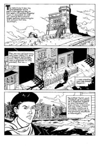
Page 1 from Wallace Ryan’s “The Narrow Way”, ©2018 Wallace Ryan
In doing so, he’s contributing to a genre that has come to dominate contemporary comics. Graphic life narrative, as comics scholar Hillary Chute calls it, has proven appealing to artists and popular with audiences. One can point to dozens of examples of this life-writing, of which Art Spiegelman’s Maus, Alison Bechdel’s Fun Home, and Marjane Satrapi’s Persepolis are the best known.
Wallace’s account of his grandfather’s war experience is likely to be the first long-form life narrative by a Newfoundland cartoonist. It’s a work in progress, and it will be years before it’s finished. (Maybe even decades: Jason Lutes began work on Berlin, his great novel of Weimar-era Germany, in the 1980s. The final chapter was just published as a pamphlet this past April; the complete novel will be published in the fall.) But when concluded, Wallace’s book is sure to be a notable contribution to the literature of Newfoundland and World War 1. And because Wallace has had to make specific decisions about its form, one can already, even at this early stage, make some critical observations about it.
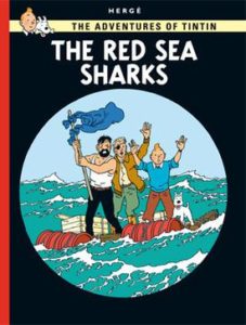
Cover of “The Red Sea Sharks”, by Hergé.
Form, it bears repeating, is not a neutral element of a work of art but a repository and expression of ideology. A resonant example in comics is the clear-line style with which the Belgian cartoonist Hergé portrayed the globe-spanning adventures of Tintin, the heroic boy reporter. Hergé maintained that the series’ clear-line style expressed its optimistic ethic. Scholar Pierre Fresnault-Deruelle summarizes the politics of the Hergé image as follows: “the transparency of the Tintin image [is] ultimately rooted in a more essential transparency, that of the world itself.” He suggests that Hergé’s clear-line style derives from early 20th-century children’s book illustration, which familiarized child readers with the European Empire: “a link exists between the desire to show ‘other’ places and things and the precision and ‘documentarism’ that prevails at their mise-en-forme. … Images of exoticism and those of everyday life can coexist. … Exoticism, like adventure, is just down the street.”
The relevant element of form in Wallace’s work is the grid, which is the particular system he has chosen for arranging panels on the page. To adopt a nine-panel grid means to impose the same basic template on each page – three rows of three panels each. Such a template admits considerable variety. A cartoonist using the grid might, for instance, combine all the panels of a given column or row into one, making a single large panel spanning a third of the page. For that matter, the cartoonist might combine all nine panels into a single master panel. But even in these circumstances the grid remains subliminally present, so that one measures a given page partly through its conformity to or divergence from the nine-panel template.
The grid has certain specific effects. The cartoonist Eddie Campbell describes one of its virtues as follows: “if two is an accident and three is a pattern, then it follows that 3×3 is the smallest arrangement out of which you can hope to make and find patterns. It’s also the basis of the game ‘noughts and crosses,’ in which the horizontals, verticals, and also the diagonals form independent lines.” The nine-panel page thus creates (or invites readers to perceive) relationships between panels along various axes. And the grid has a temporal logic, too. Since comics are an art that renders time as space, panels that are the same size suggest similar units of diegetic time. The best-known comic that uses a nine-panel grid is Alan Moore and Dave Gibbons’ Watchmen, and there the grid expresses in formal terms the plot’s preoccupation with a looming nuclear Armageddon. Panel by panel the narrative advances towards it at an inexorable, metronomic pace.
But the grid-system is only one possibility among many for rendering time as space. Artists have an exceptional range of options available to them when designing the comics page. The chief constraint is the page itself, the size of which is generally fixed – but the eminent cartoonist Chris Ware found a way around even this when he published Building Stories, a comic consisting of fourteen individual booklets of varying dimensions, all contained in a cardboard box like the elements of a board game.
Grids of various dimensions are conventional in comics but not inevitable. The work of the adventurous French cartoonist Baudoin offers a counterexample: his recent, surpassingly beautiful biography of Salvador Dalí adopts a page design as willfully idiosyncratic as its subject, alternating between delirious full-page images that evoke or cite Dalí’s work, on the one hand, and pages that juxtapose panels in more conventional ways, on the other.
A nine-panel grid, then, is a matter of artistic calculation, and implies an ethic. In saying that the stability of the grid makes it a suitable structure for writing a work of history, Wallace reveals a particular understanding of what history is. It is not, as the mid-century Cambridge historian Herbert Butterfield allegedly quipped, “just one bloody thing after another.”
Nor is it what philosopher and cultural critic Walter Benjamin described as the past as seen from the perspective of the Angel of History, “one single catastrophe which keeps piling wreckage upon wreckage and hurls it in front of his feet.” The history that Wallace is picturing in the grid is stable, orderly, settled.
This is, to put it mildly, an interesting ethic for a comic about World War 1. As Language and Comparative Literature professor Mariano Siskind observes, “critical tradition agrees that no conflict is as inextricably linked to the modernist aesthetic intervention as the First World War.” That “modernist intervention” is an aesthetic of tangles, shells, and wreckage that cohere through montage and other forms of assemblage, “fragments I have shored against my ruins,” as TS Eliot writes in The Waste Land. The stable history that Wallace detects in the grid is starkly at odds with this poetry of shards. It’s more reminiscent of official sites of war memory. The grid of Wallace’s page echoes that of the Canadian war cemeteries in Belgium, with their rows upon orderly rows of graves, so deliberately serene that depending on your sensibility you might find it elevating and beautiful or you might find it – as I do – obscene, mantling the human wreckage in manicured turf, a site of remembrance for amnesiacs. Its orderliness likewise echoes the War Memorial in downtown St John’s, where triumphant Britannia stands with her unsheathed sword above the four emblematic Newfoundland men, who stand or crouch on their lower plinths, all of them dutifully subservient to the demands of Empire.
In Edward Riche’s recent play about the War Memorial, Dedication, a woman whose brother is among the casualties bitterly envisions a different memorial, one that acknowledges the terrible costs of war, expressed in the mutilated bodies of veterans. It is a memorial as Otto Dix might have conceived it, a War- Torn Memorial, which in its refusal to console would have the virtue of honesty.
Despite tendering this provocative vision, Riche’s play was formally conventional, even old-fashioned, a drawing-room drama of ideas that Ibsen and Shaw would have recognized. When I saw it last November this conservatism exasperated me. But I may have missed Riche’s point – precisely that the fusty dramatic form was inadequate to contain the explosive vision at its heart. Months later, what lingers in the memory is not the drawing room but the alternative memorial angrily conjured there.
One might, in short, overestimate the structure’s powers of containment. Siegfried Sassoon’s “Glory of Women” or Wilfred Owen’s “Anthem for Doomed Youth” relate the horrors of World War 1 – the faces “trodden deeper in the mud”; “the shrill, demented choirs of wailing shells” – using the same strict meter and rhyme scheme with which Shakespeare compared lovers to summer days. Eight lines to the volta, and then a sestet, wrestling catastrophe into order. Or trying to: the interest of these sonnets (as in most art about war) lies in the irresolvable tension between catastrophe and its representation.
In Wallace’s graphic memoir, the grid may likewise be only one term in a dialectic. Wallace plans to transcribe his grandfather’s testimony verbatim – “I like his turn of phrase,” he says, “so I wanted to keep [it]” – and this decision in itself may test the notion of history that he expresses in the grid. He may also find ways to challenge the grid through images. Unlike many contemporary graphic memoirists, Wallace acknowledges debts not only to underground and alternative cartoonists like Justin Green and Robert Crumb but to cartoonists working in the industry’s mainstream, publishing their most influential work with DC and Marvel. In particular, Wallace cites a debt to Jack Kirby, the inexhaustibly imaginative creator of the Hulk, Thor, and other superheroes. “Every panel [in a Kirby comic],” he says, “is filled with power.” Anyone who knows Kirby’s work will acknowledge the force of this description. To bring the exorbitant energy of Kirby’s aesthetic to a representation of World War 1 is to court bad taste, using the visual repertoire of superhero comics to represent what Sassoon called “the world’s worst wound.” But insofar as good taste lies in restraint, a strategic tastelessness may be apt, the best means of expressing the exorbitancy of the Somme.
The tension of The Narrow Way may lie, then, between the image and the grid, between trauma and its would-be containment.